Fashion colors
Autumn / Winter 27.28
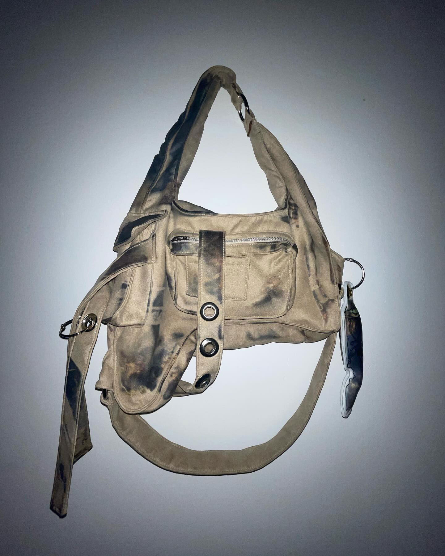
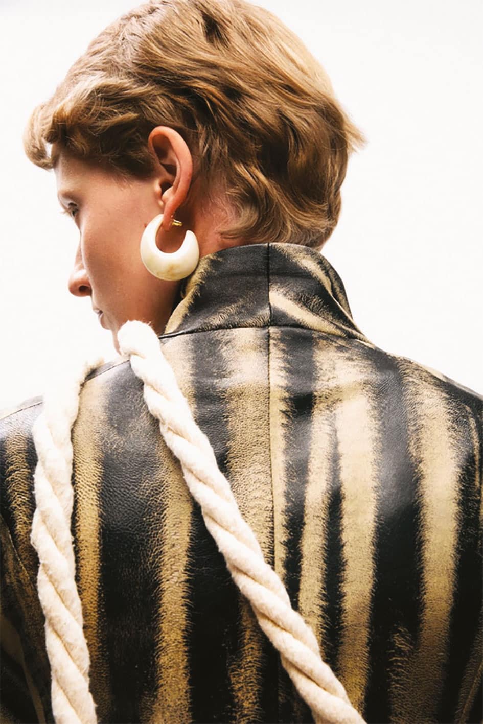
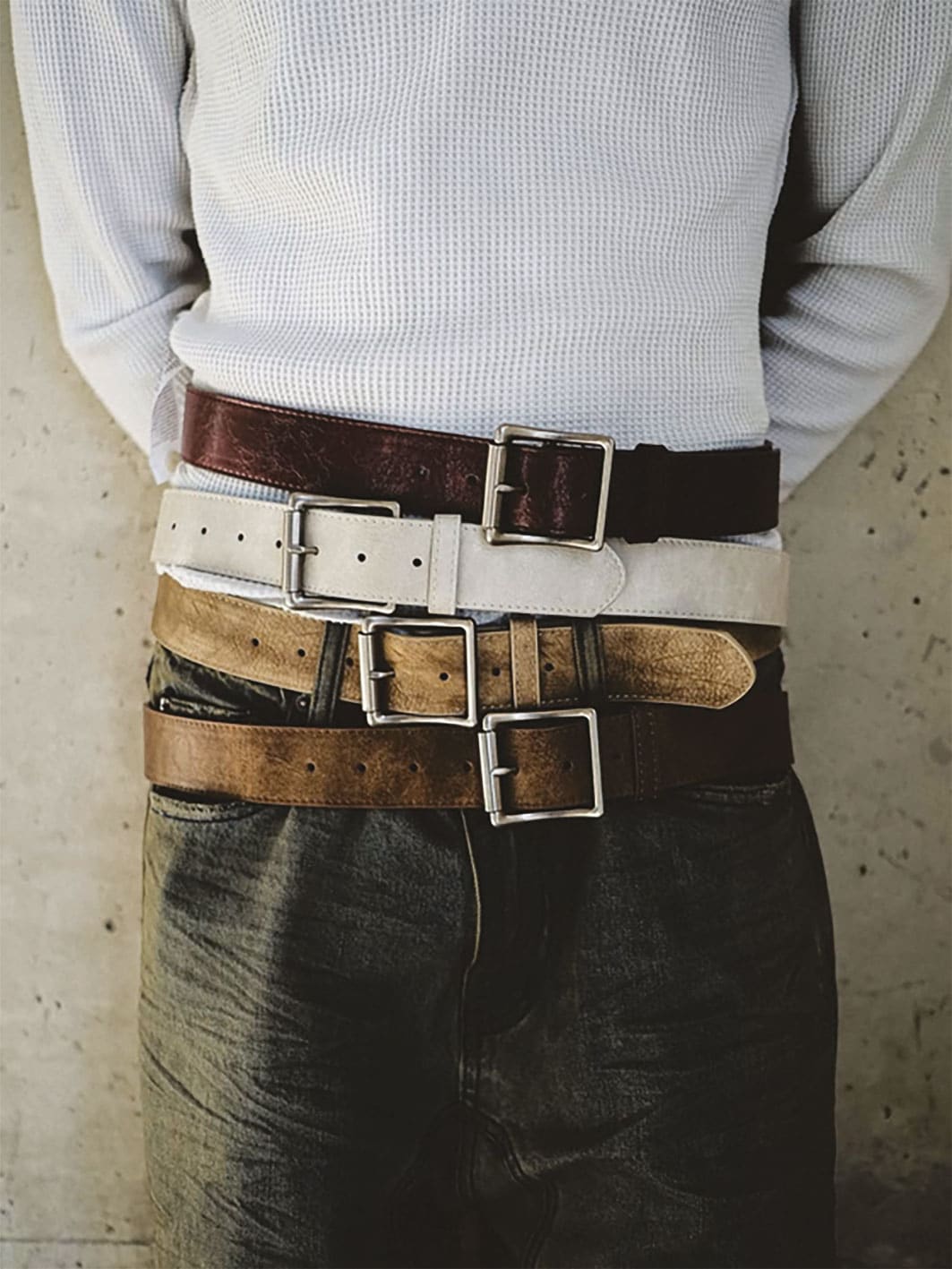
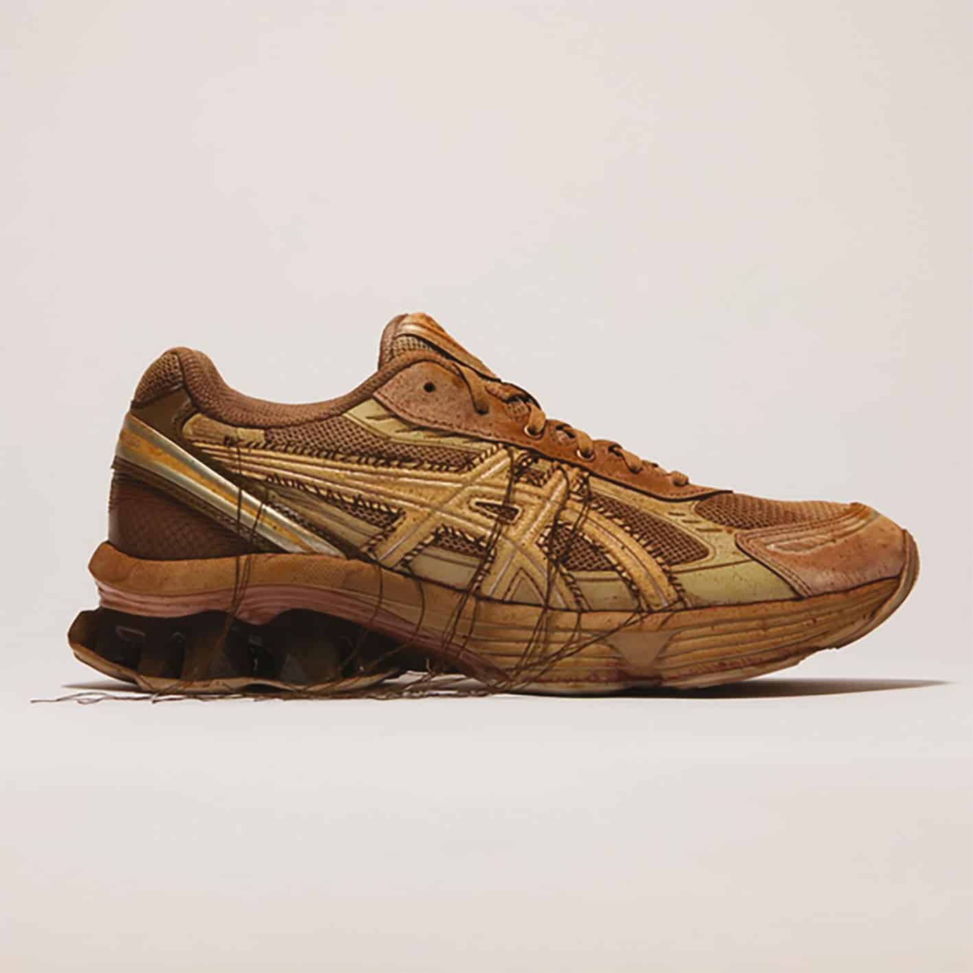
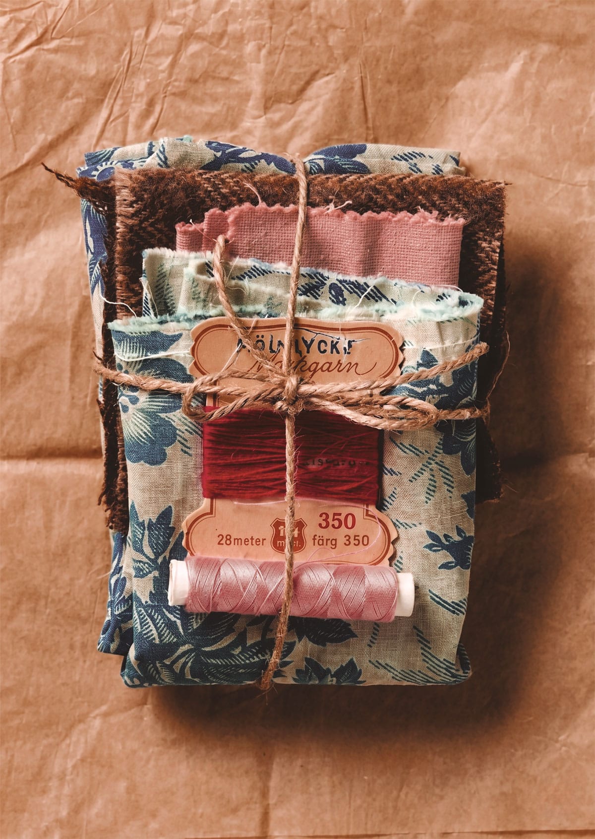
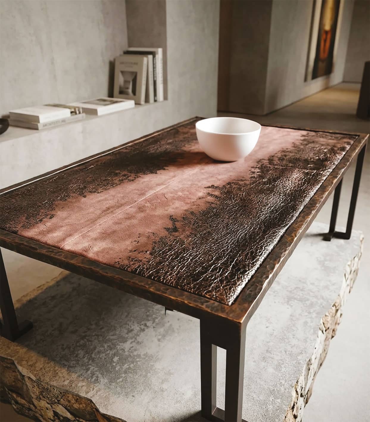
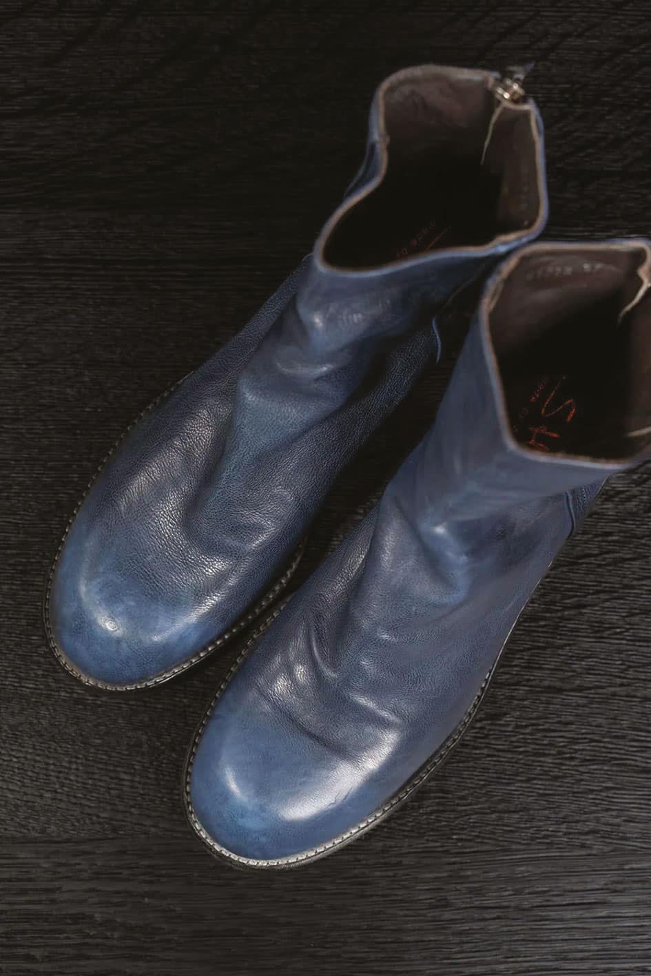
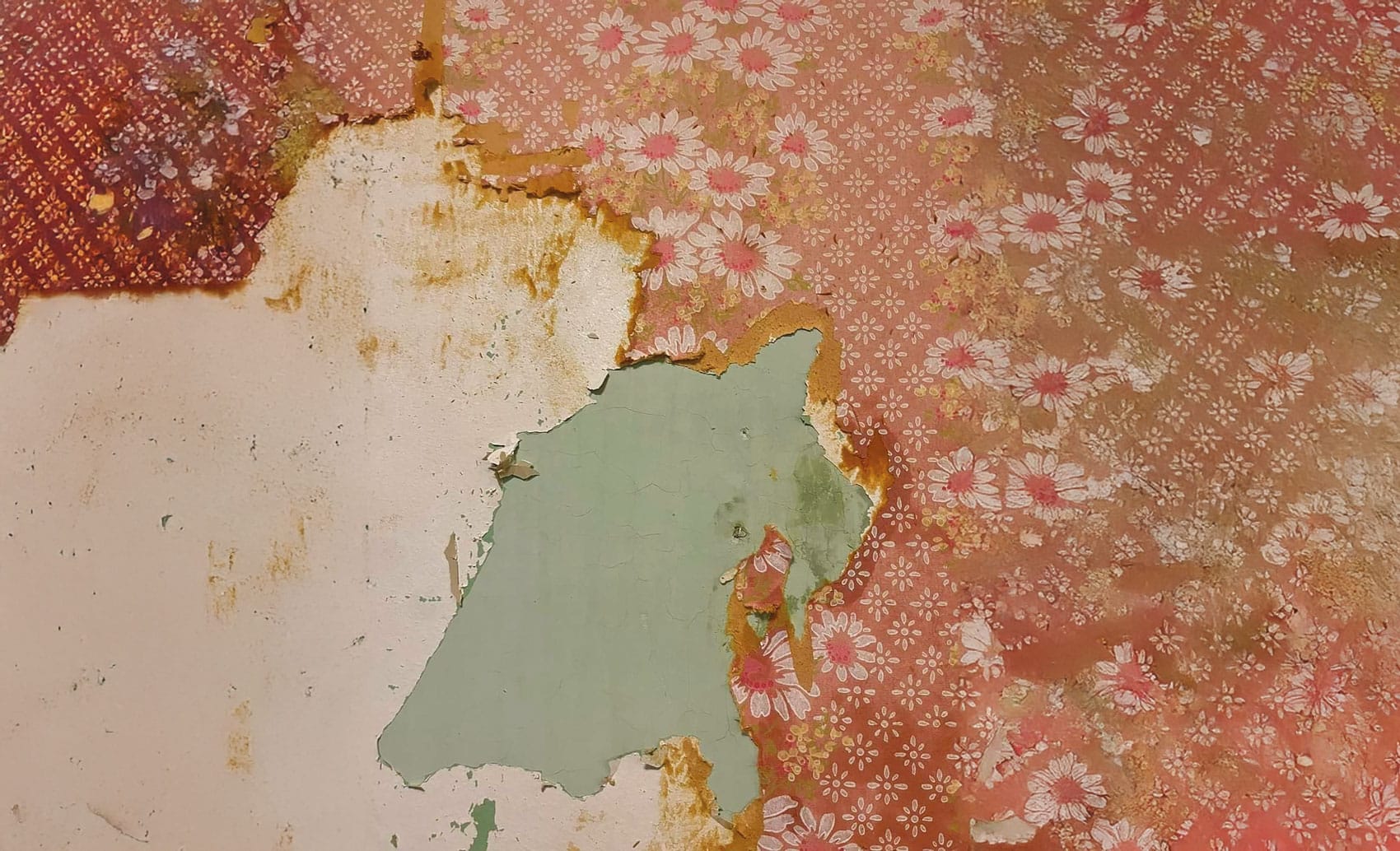
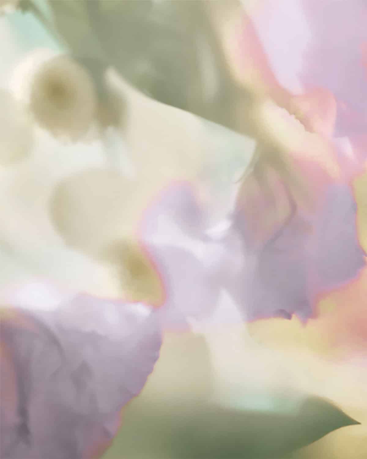
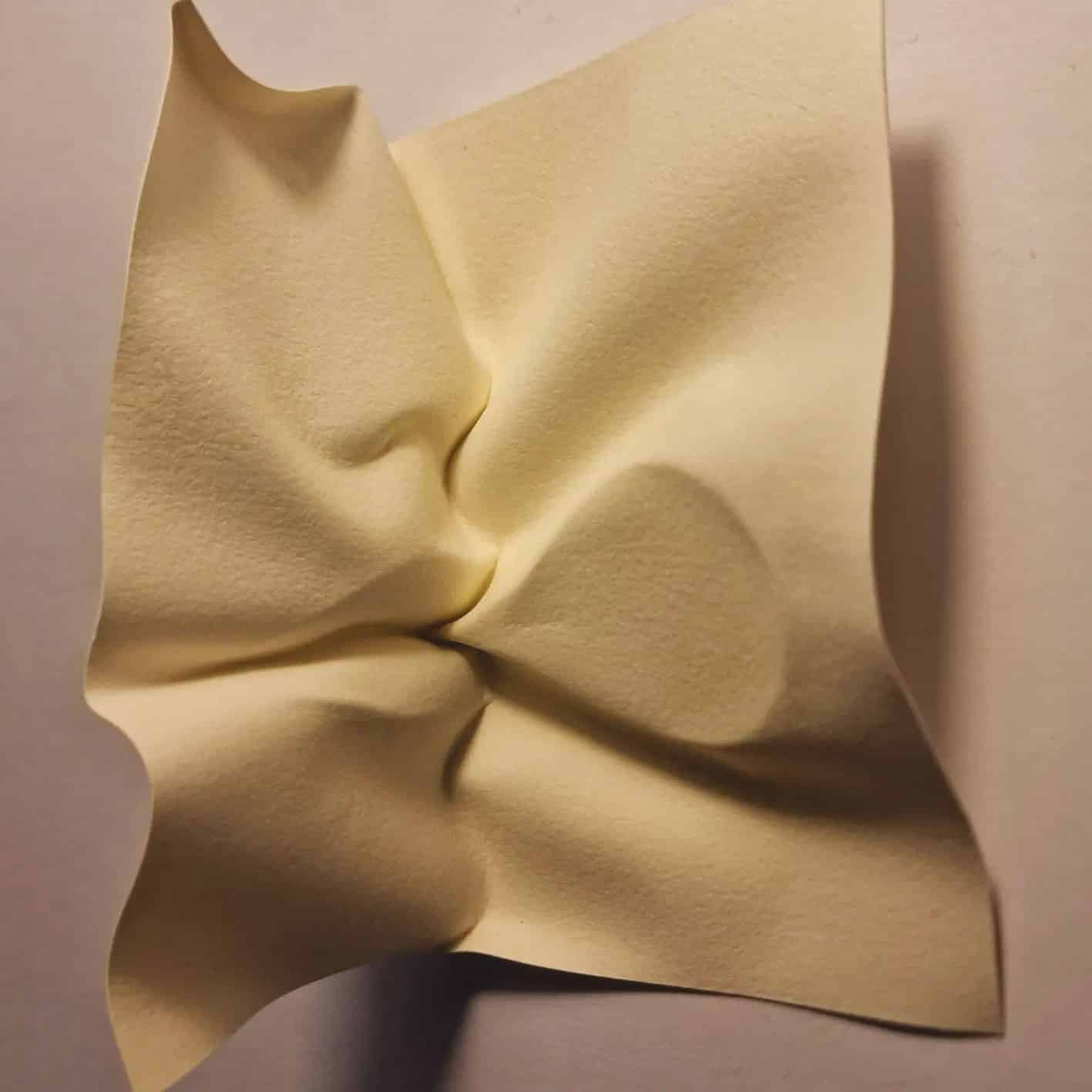
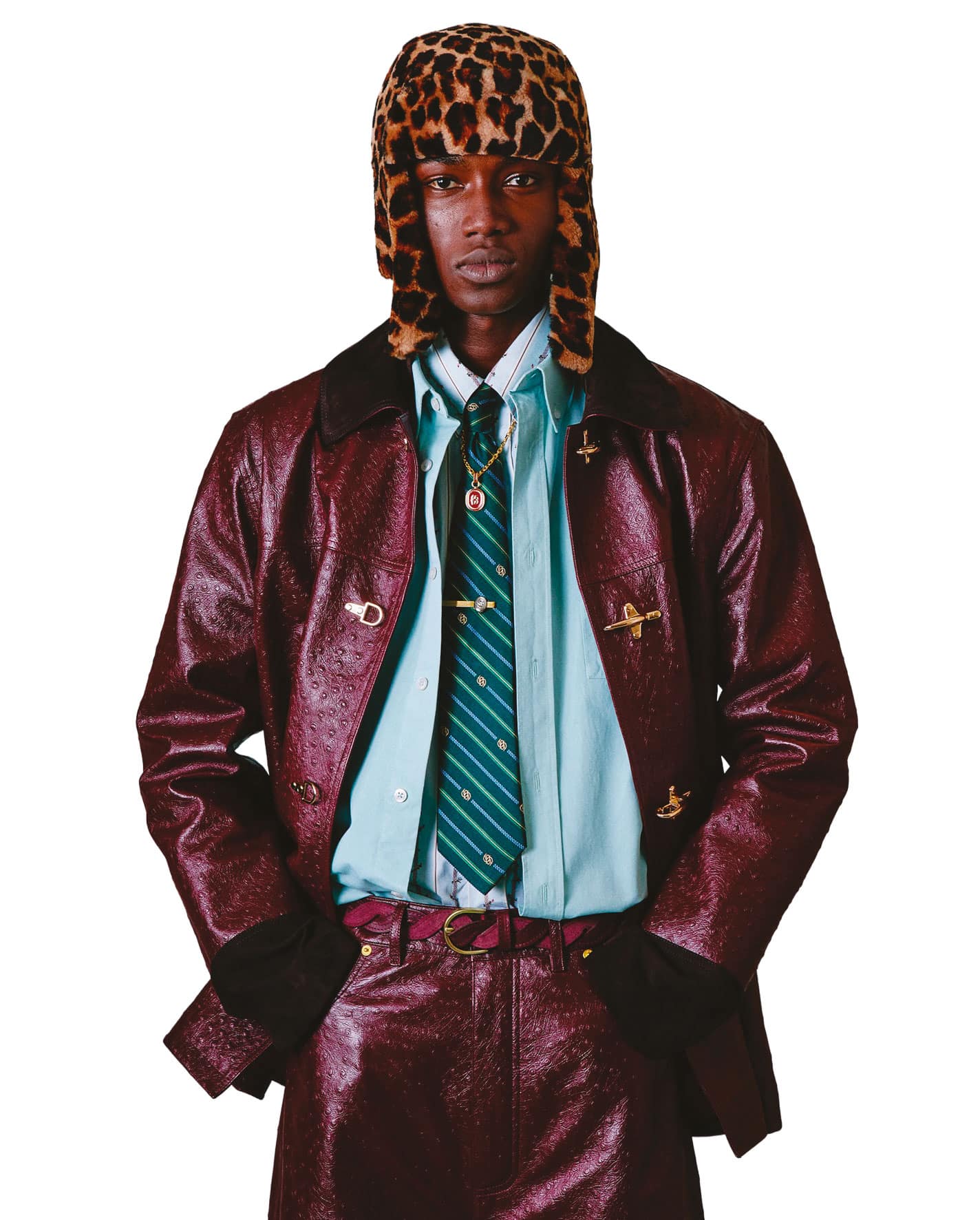
(UN)Refined
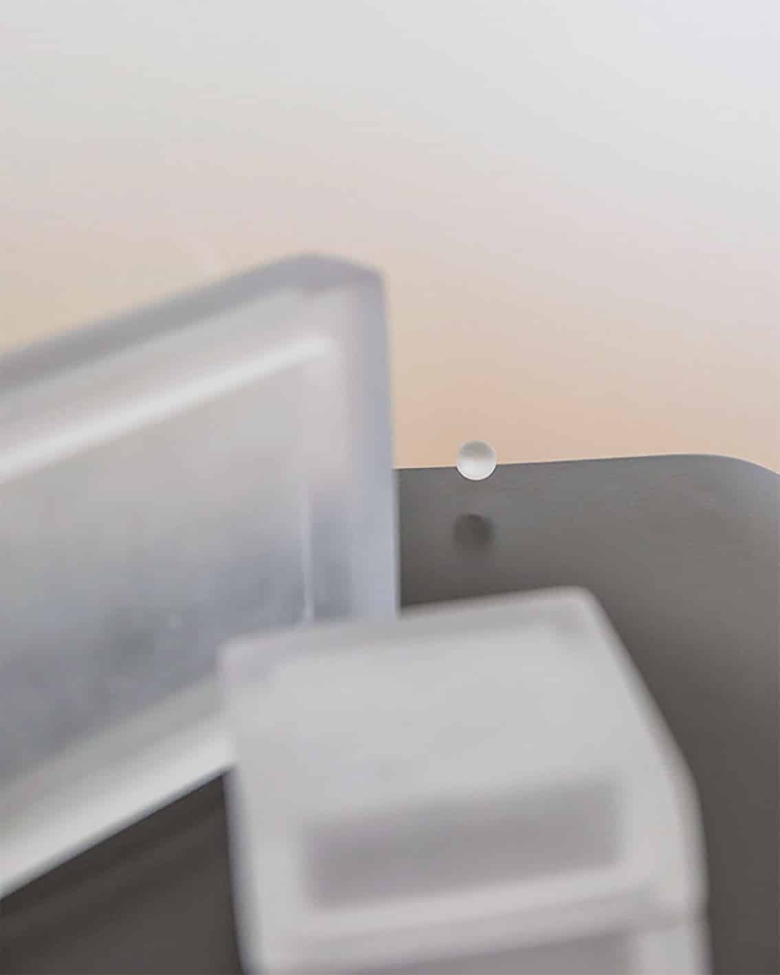
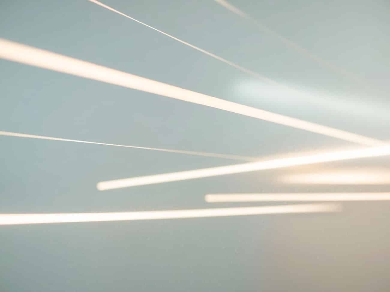
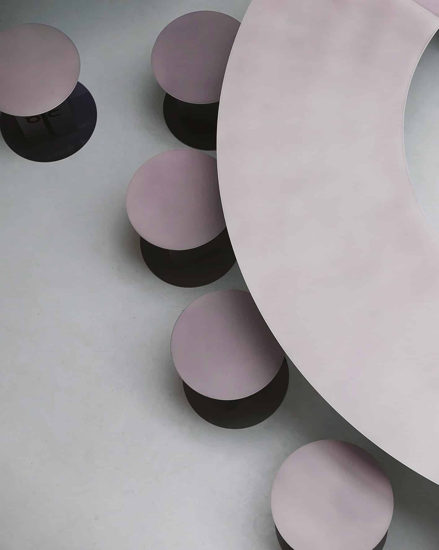
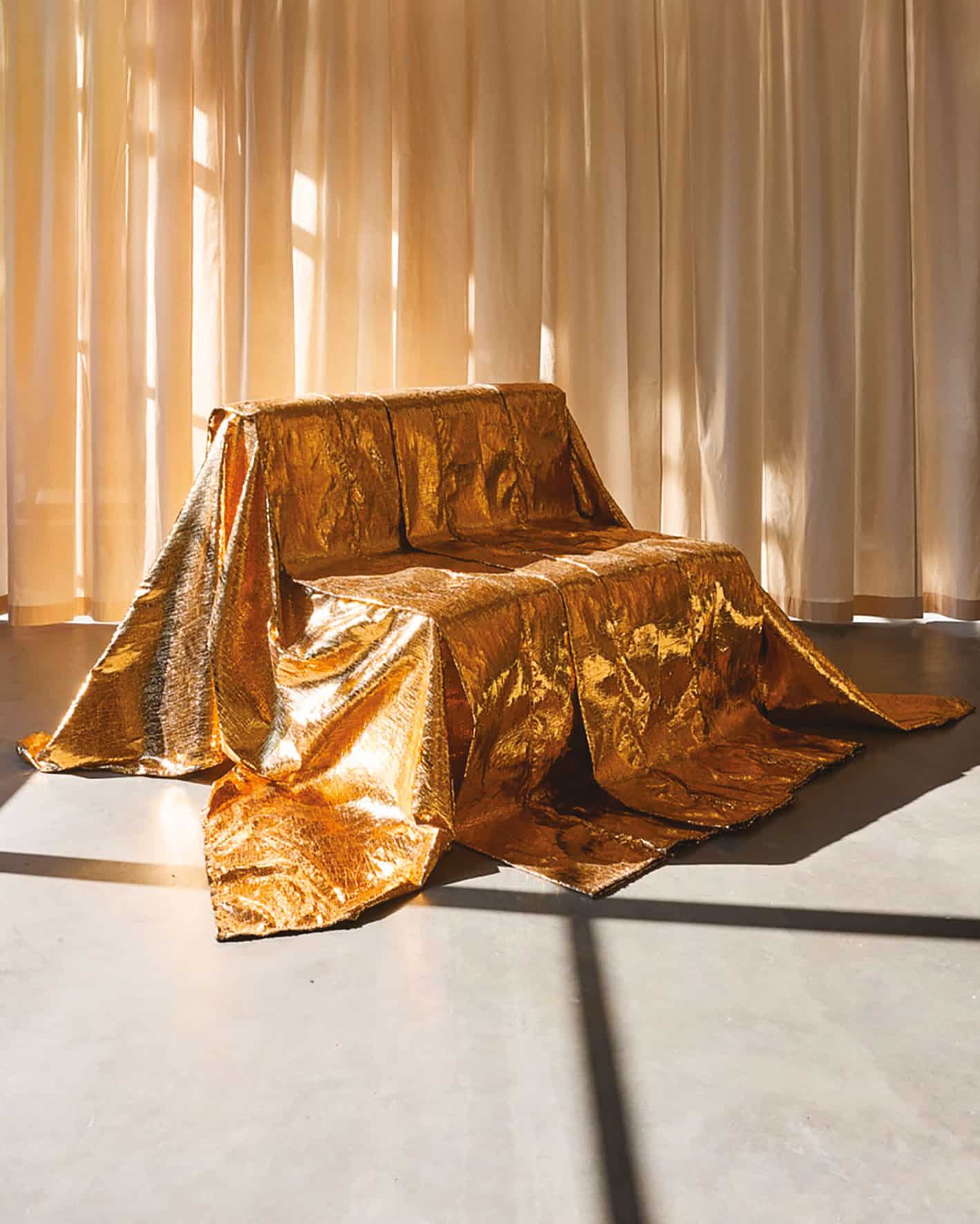
Tech whisper
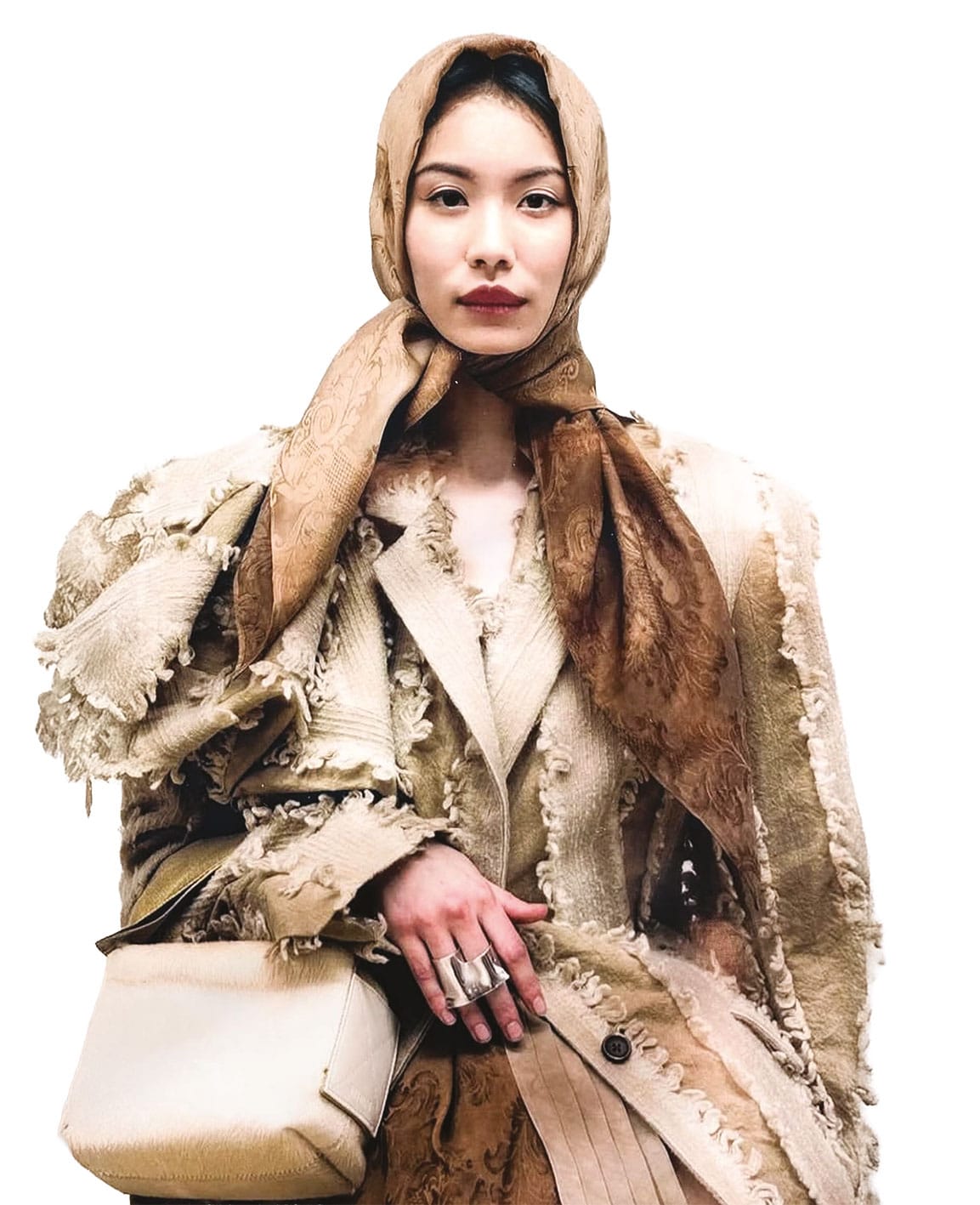
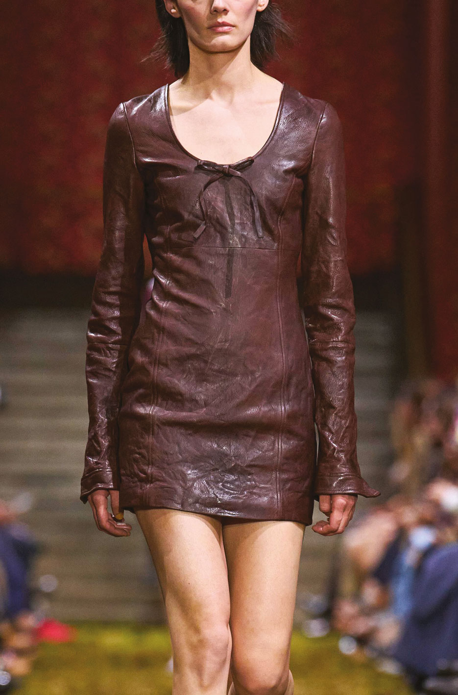
Gentel hold
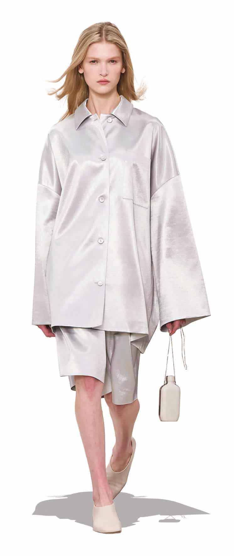
Grandeur
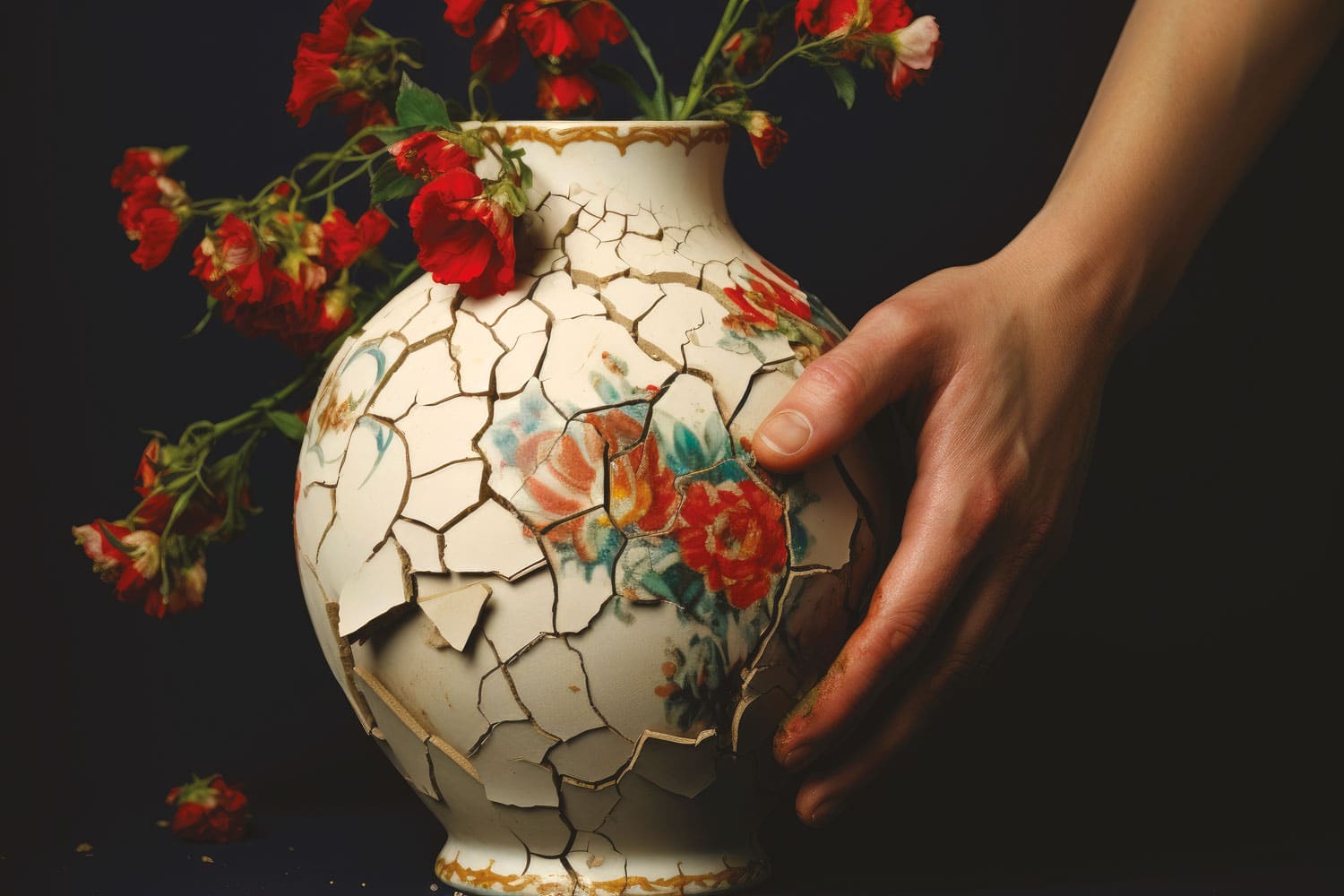
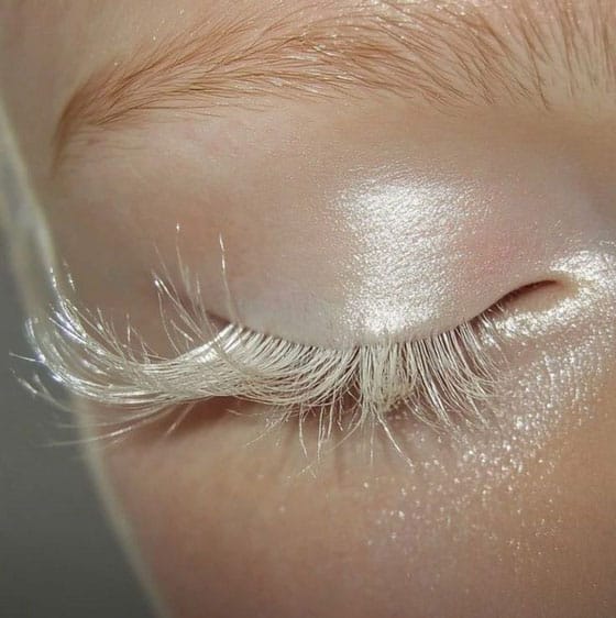
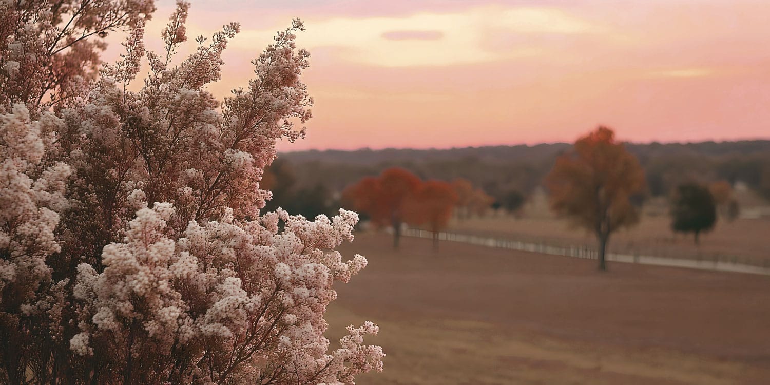
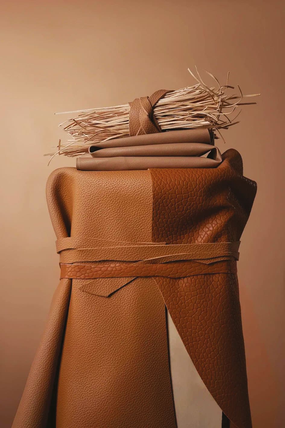
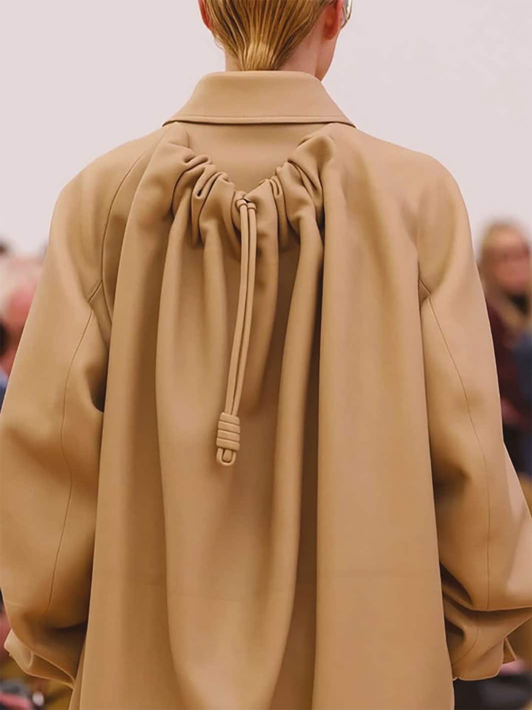
(UN)Refined
INSPIRATION
In un mondo che ha privilegiato per troppo tempo la perfezione e la standardizzazione, (UN)REFINED celebra l’autenticità, l’inaspettato e la bellezza delle imperfezioni. Gli errori, i dettagli grezzi e gli aspetti supermaterici diventano protagonisti, trasformando ogni gesto in segno distintivo e raccontando il valore del fatto a mano, della spontaneità e del caso.
COLORS
Questa palette è un racconto di calma e sostanza, un viaggio sensoriale che parte dal calore rassicurante di tonalità naturali del marrone e del beige con accenti rosati e tonalità più decise del grigio azzurrato, del verde e del rosso mattone. Evoca il profumo del cuoio vissuto, con le sue imperfezioni e irregolarità che insieme alle altre tonalità sussurra un’eleganza senza tempo ritrovando la bellezza discreta di ciò che è autentico e duraturo.
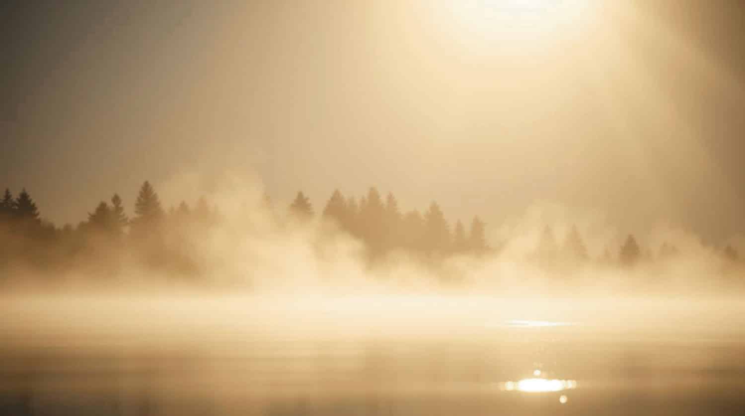
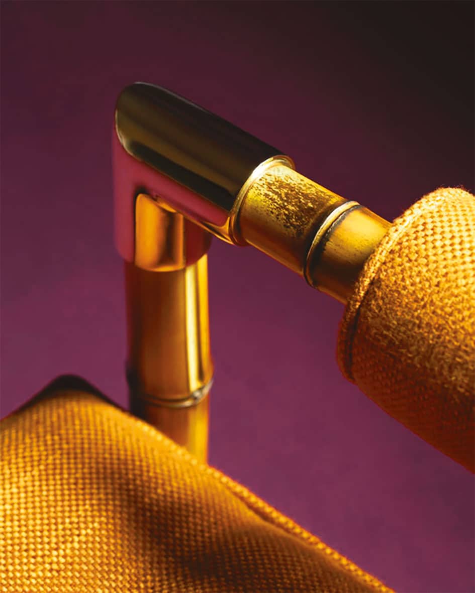
Tech whisper
INSPIRATION
In un mondo spesso saturo di dettagli superflui e di sovraccarico visivo, TECH WHISPER invita a rallentare lo sguardo e a riscoprire la forza della purezza. I materiali e le finiture diventano protagonisti, catturando la luce e trasmettendo leggerezza, trasparenza e armonia. Raccontare questo scenario per la stagione AW27/28 significa rispondere al bisogno contemporaneo di chiarezza, calma e autenticità dove la ricerca della purezza e della leggerezza diventano strumento creativo fondamentale.
COLORS
La palette cromatica evoca un’estetica futuristica ma profondamente umana, dove la tecnologia non è fredda ma sussurrata attraverso una palette di pastelli desaturati e atmosfere eteree. È una sinergia di pigmenti che sembrano filtrati da uno schermo opaco, perfetti per un design che cerca l’innovazione senza rinunciare a un tocco di fragilità e accoglienza organica.
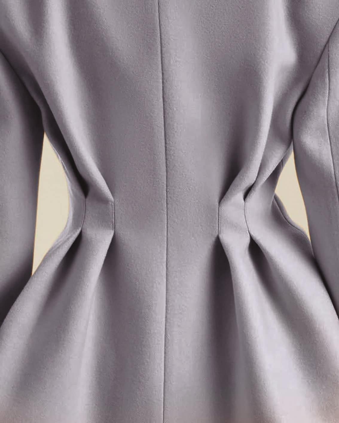
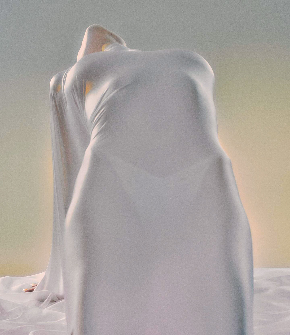
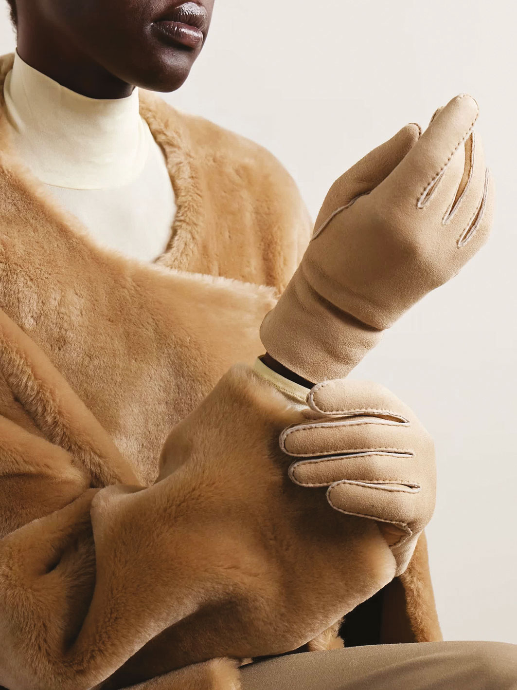
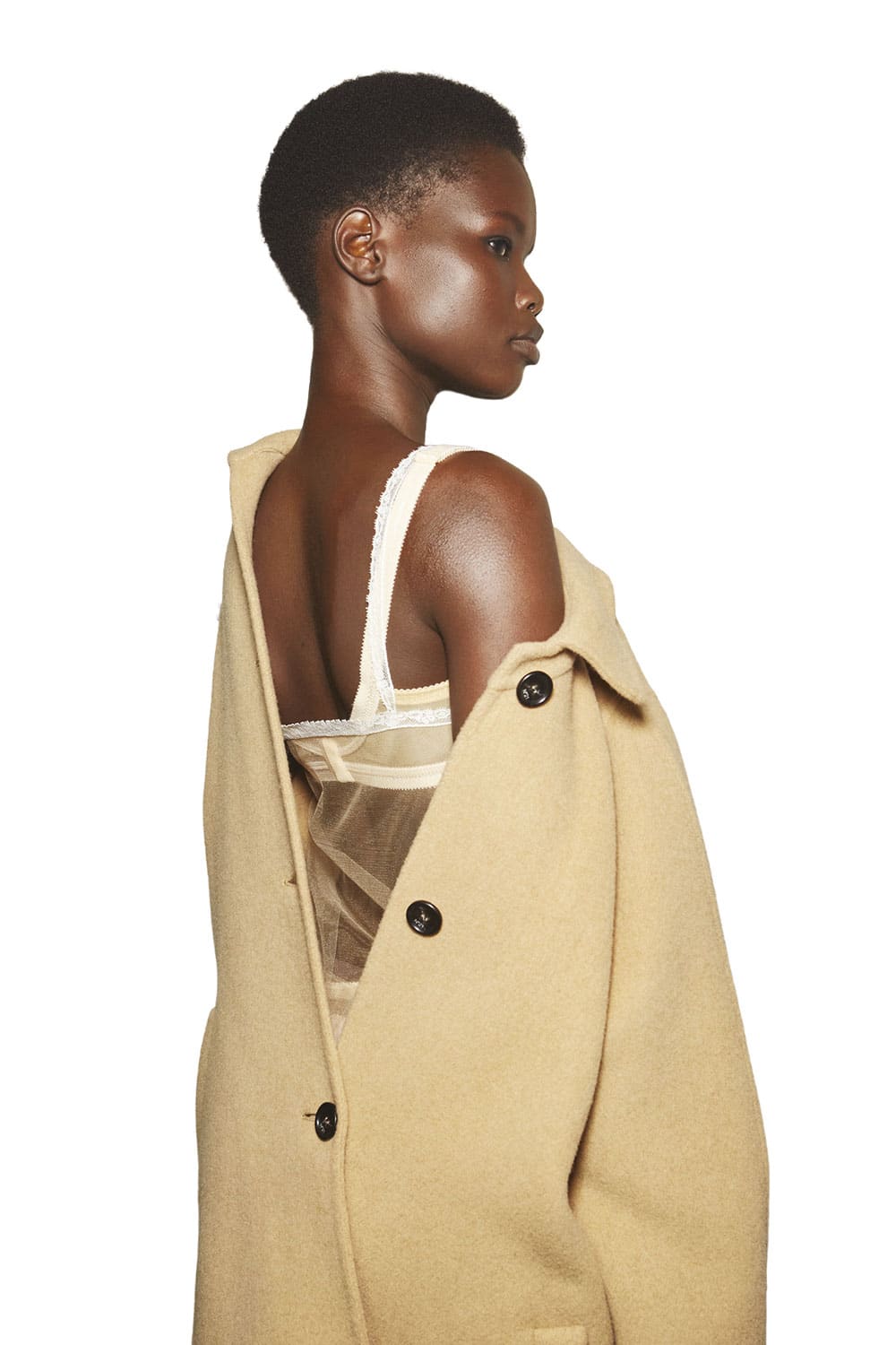
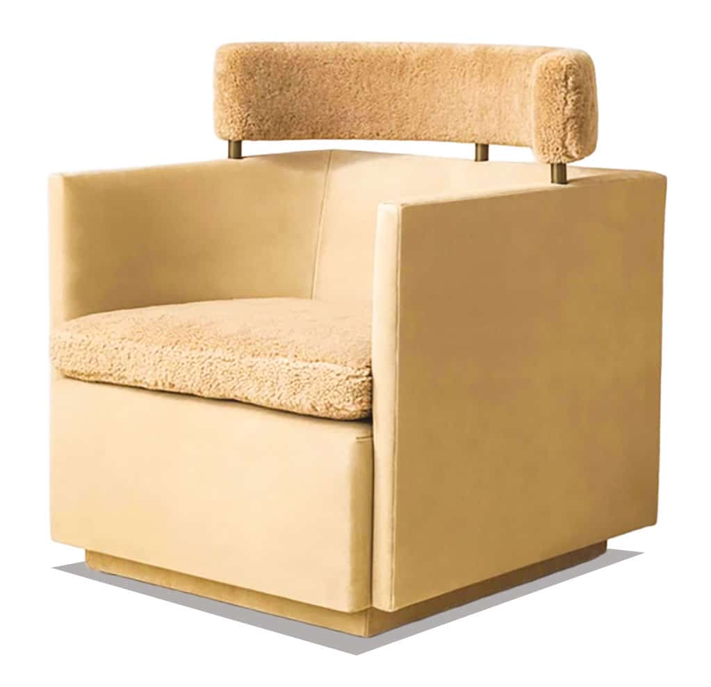
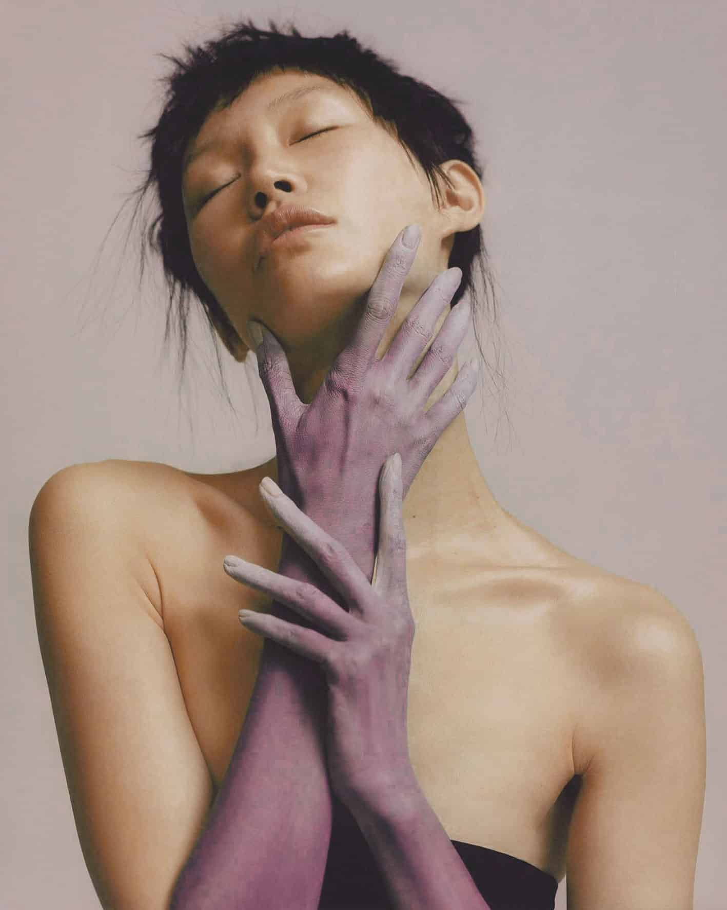
Gentel hold
INSPIRATION
GENTLE HOLD offre una pausa sensoriale: un invito a riscoprire la dimensione del tatto, il piacere dei materiali e l’eleganza della semplicità, trasformando la moda in esperienza e conforto. L’atmosfera che emerge è elegante, raffinata e sofisticata, dove i materiali dialogano tra loro con armonia e discrezione, suggerendo calore, sicurezza e benessere.
COLORS
L’armonia si manifesta come un’estetica avvolgente e profondamente rassicurante, concepita per offrire un senso di protezione e comfort tattile. Qui la palette abbraccia le tonalità naturali e calde che ricordano la morbidezza della terra e della pelle, le sfumature più intense, come Leather Brown e il profondo Madder Brown, aggiungono una base solida e
radicata, evocando materiali organici e artigianali che invitano al tocco.
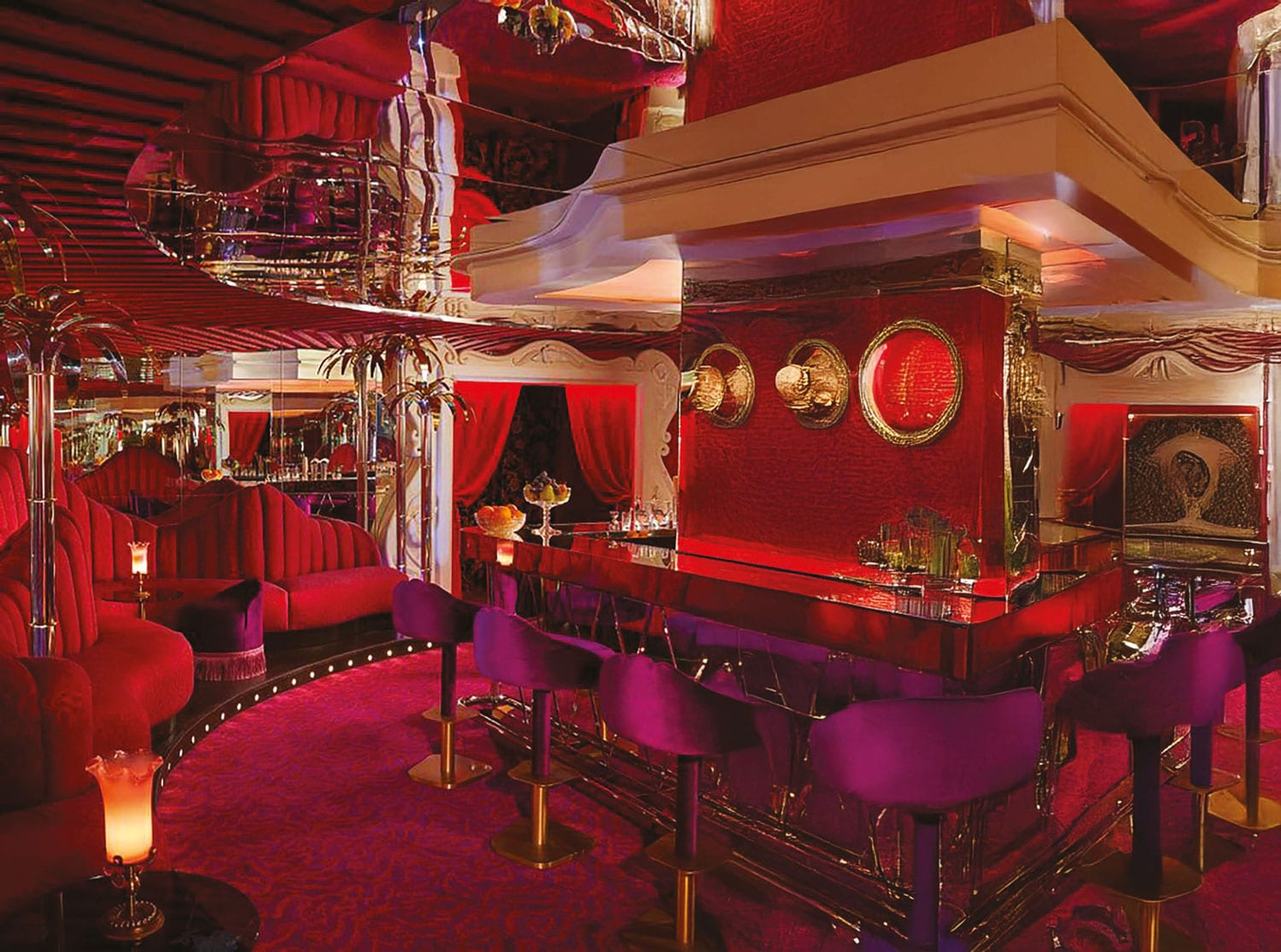
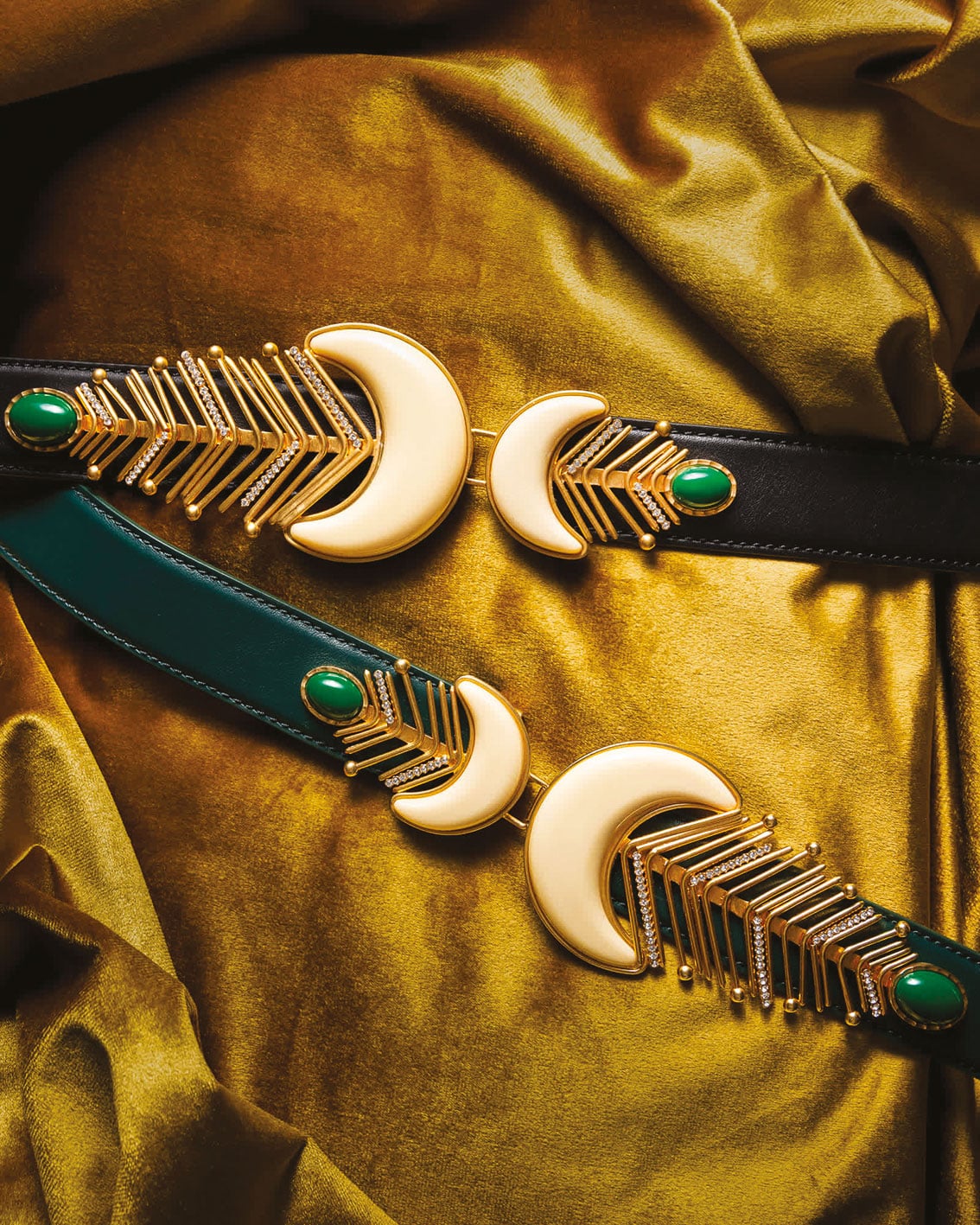
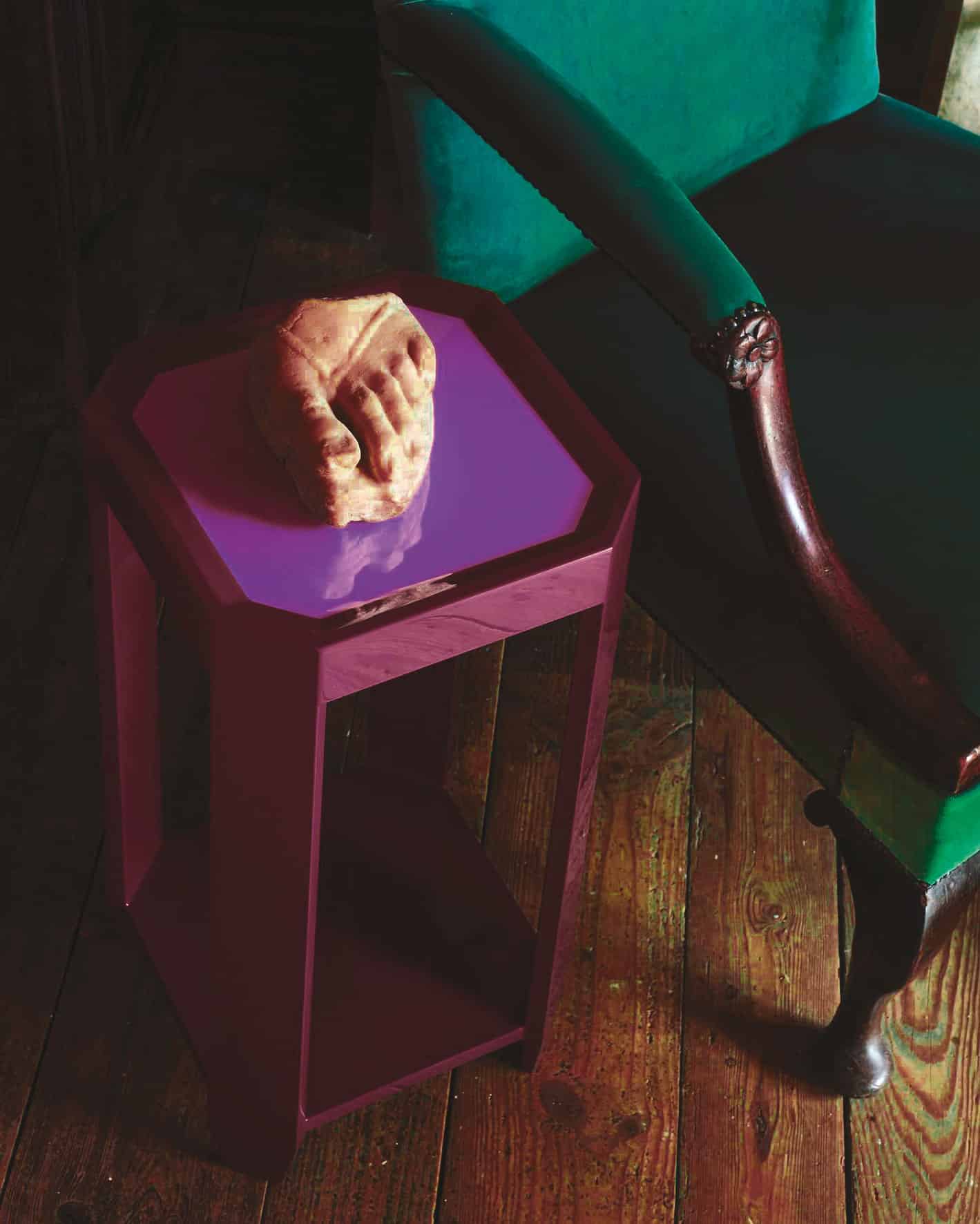
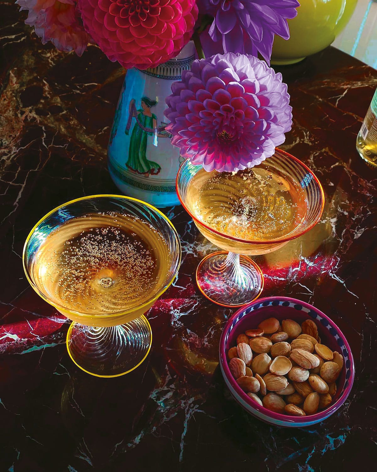
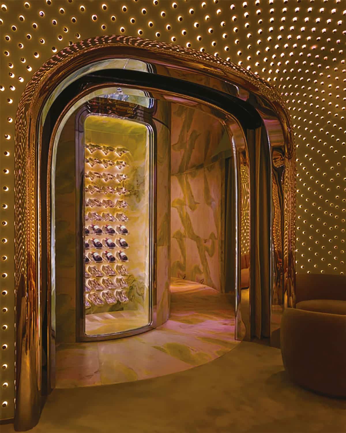
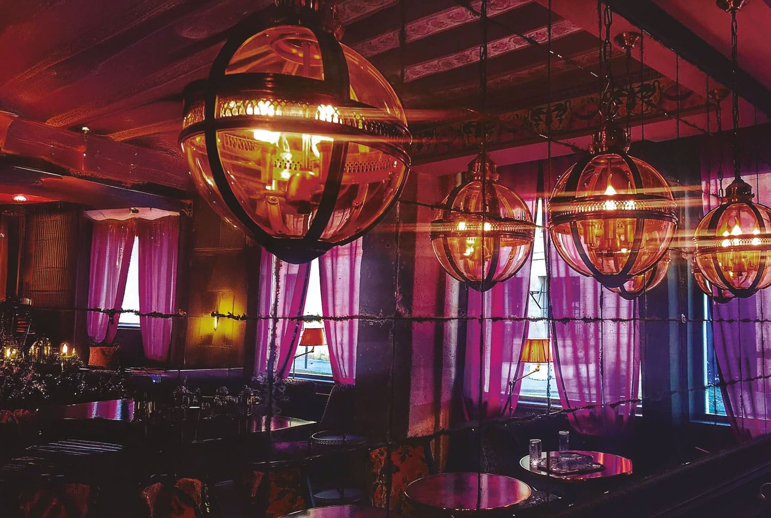
Grandeur
INSPIRATION
Oggi c’è una forte necessità di affermare la propria personalità e celebrare la vita attraverso la moda. In un’epoca spesso dominata dalla frenesia, dalla standardizzazione e dal minimalismo, GRANDEUR offre una scossa creativa: invita a osare, a sperimentare, a giocare con materiali e colore e a riscoprire il piacere dello stupore. È un richiamo alla libertà espressiva, al piacere del gesto creativo e alla potenza delle immagini e dei materiali che trasmettono energia e fascino. È un’esplosione di sensazioni piene e dense, un linguaggio estetico che mescola energia, glamour e lusso in ogni superficie, movimento e colore.
COLORS
L’armonia celebra un’estetica dove il colore diventa protagonista assoluto con tonalità vibranti e sature ispirate alla ricchezza delle tonalità gioiello: dal viola profondo al verde lussureggiante, ogni nuance sprigiona un’energia esuberante e carismatica. I contrasti sono decisi e teatrali creando un ritmo visivo dinamico e sofisticato. È un mix cromatico potente capace di trasmettere un senso di lusso contemporaneo e personalità audace.
We collaborate?
Find out more about our collections